miércoles, 28 de febrero de 2018

Point cloud smart mapping in 3D with Scene Viewer

Point cloud smart mapping in 3D with Scene Viewer

Today, I want to discuss how you can use Scene Viewer to style and configure point clouds directly in your browser, interactively, and intuitively, leveraging the power of smart mapping smart defaults and color ramp sliders. Cities across the world are leveraging the power of point clouds to visualize and present their 3D data, and the smart mapping styles in Scene Viewer give you the ability to customize your visualizations of point cloud data to suite the unique needs of your projects. All you need to do is sign in to ArcGIS Online and you’re on your way.


Explore point cloud styles

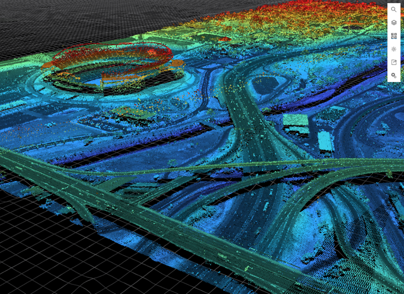
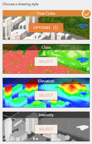
To visualize point cloud scene layers, I can choose one of the different smart mapping drawing styles available based on the point cloud attributes: True Color, Class, Elevation, and Intensity. Each style has its own strengths and value depending on the scene I’m trying to create. For example, I can use the Elevation style to explore and understand the changing elevation of the structures and terrain in my scenes.

Hint: The smart mapping styles also include an easy-to-use slider that lets me manually change the point size from smaller to larger and vice versa. Furthermore, if my point cloud layer doesn’t match the terrain, I can apply an offset to my point cloud layer to align it better.

Show your true colors

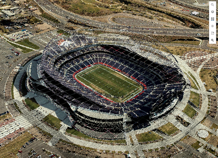
If I’m interested in displaying the realistic look and feel of my city or landscape, I would choose the True Color style because it displays point cloud data with the true RGB values collected in the LiDAR remote-sensing process. For example, this scene of Mile High Stadium in Denver, Colorado really got my attention. The scene showcases point cloud data created by Merrick and with the True Color style chosen, I can even clearly see the team name “BRONCOS” spelled out in the end zone!

Can I see my point cloud data classified?

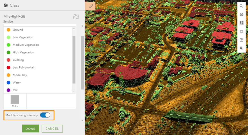
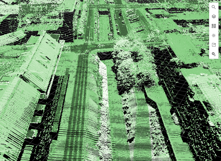
With the Class style, I can assign a specific color to the classes in the point cloud data defined in the collection process.  This is helpful when I want to emphasize and distinguish the most important elements of my scene, such as buildings, plants and vegetation, and ground.  When I open the Class style, I can see what classes are available by looking at the list and also in the legend.

Hint: If I turn the “Modulate using intensity “option on, I can shade the color of the points based on the intensity value (see the Intensity style below). This improves depth perception and perspective of my point cloud scene when many nearby points have the same color. By adding this option and playing around with the class colors, I can see much more detail, such as the roads and roof structures.

Also, in case you’re wondering what those trees are doing on the highway, please don’t call the forest service. They’re actually cars. However, LiDAR scanning is not a perfect science and sometimes automated classification fails and puts some points in the wrong category.

What I’d really like to see is the elevation of my points

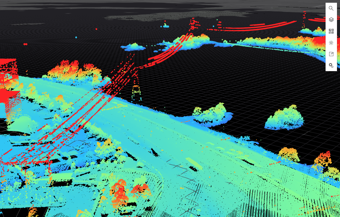
I chose the Elevation style to visualize this Helsinki scene I created to emphasize the higher areas and structures. Knowing the elevation of buildings and terrain throughout Helsinki is very important from an urban planning, environmental, or industrial perspective. For example, if I am in the shipping or utilities industries, I may want to focus on structures higher than a certain height, such as cargo cranes or power lines. I can adjust the Elevation style sliders to make the higher areas and structures stand out more.

What is intensity in point clouds?

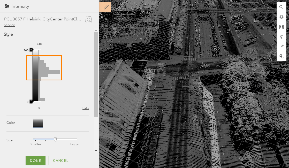
Using the Intensity style is another great way to see the fine details and textures of Helsinki’s urban landscape. Intensity is a measure of the return strength of the laser pulse that generated the points in the point cloud data collection process. With the Intensity style on, I can get even more detail and contrast in my scene by adjusting the slider to match the distribution of point values.

First, I drop down the top slider bar to 190 intensity value. Then I set the maximum value to 200 to reset the distribution of the color ramp.

Now I can really see the contrast between the buildings, streets, trees, and canals. All that’s left for me to do is pick out a pleasing color ramp and my scene is finalized.

I encourage you to explore for yourself the power of smart mapping with point clouds in Scene Viewer. To learn more about point cloud smart mapping styles, see style point clouds. And feel free to share your own cool scene creations and comments.
Scenes and screenshots:
This entry was posted in 3D GISArcGIS OnlineLocal GovernmentWeb and tagged . Bookmark the permalink.

miércoles, 21 de febrero de 2018

Worthwhile Reads

Worthwhile Reads

GIS Books to Note in the New Year

By Carla Wheeler
ArcWatch Editor
Savvy GIS students and professionals know that it's important to keep up with the latest geospatial technology, which is why thousands of people attend events such as the Esri User Conference and the Esri Developer Summit and take courses and live training seminars from Esri Training.
But there's another component to the quest for learning about GIS and related technologies: reading books.
Each year, Esri Press publishes titles that cover a wide variety of topics, including Esri ArcGIS software, map use, lidar, cartography, imagery, spatial analytics, and ocean and coastal science. The latest three books focus on how to use imagery in a GIS, work with the ArcGIS Pro application, and use the technology to resolve issues faced by Native American tribes.
Imagery and GIS are inextricably linked.
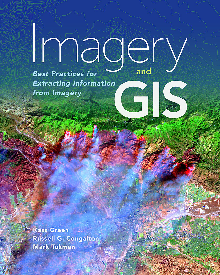
Written by top imagery experts including Kass Green, Imagery and GIS: Best Practices for Extracting Information from Imagery offers more than an overview of remote sensing. It’s a valuable resource for learning to work with imagery in a GIS.
Authors Green, along with Russell G. Congalton and Mark Tukman, show readers how to select the best imagery for their projects; work with and process the imagery; extract information from the imagery; and assess, publish, and serve imagery datasets and projects.
"This book teaches readers about the many ways that imagery brings value to GIS projects and how GIS can be used to derive value from imagery," the authors wrote in the book’s introduction. "By combining imagery and GIS, we can inventory our resources, monitor change over time, and predict the possible impacts of natural and human activities on our communities and the world."
All the authors are highly experienced in the fields of remote sensing and GIS. Green is the recipient of the American Society for Photogrammetry and Remote Sensing (ASPRS) Honorary Lifetime Achievement Award.
(Esri, print edition ISBN: 9781589484542, $99.99; e-book ISBN 9781589484894, $99.99)
This textbook teaches you the fundamentals of working with ArcGIS Pro.
Students, teachers, and GIS professionals who want an introductory textbook on how to use ArcGIS Pro should start with GIS Tutorial 1 for ArcGIS Pro. Authors Wilpen Gorr and Kristen Kurland provide clear, step-by-step instructions on how to use the software to create and manage data, design maps, conduct spatial analysis, generate 3D scenes, and share projects. The workbook includes information on how to use ArcGIS Pro in conjunction with ArcGIS Online and several of its mobile apps including Collector for ArcGIS, Operations Dashboard for ArcGIS, and Esri Story Maps.
Readers work on projects based on real-world scenarios, including doing an analysis of crime patterns in a city, creating 3D models of buildings for an urban planning project, and locating the best places in a community to open farmers' markets for the purpose of increasing access to healthy foods.
The authors call the book “a complete learning system for GIS." Additional instructor resources are available, including student assignments, solutions for the assignments, PowerPoint lectures, and grading rubrics.
(Esri, print edition ISBN: 97815894844665, $99.99; e-book edition ISBN: 9781589484931, $99.99)
Inspiring GIS stories are told by Native American tribes.
In Tribal GIS, tribal governments detail how GIS is being used by Native Americans working on a wide range of projects, from protecting the environment to planning how to best use ancestral lands. Dozens of stories are included in this second edition, describing how GIS tribes across the United States use the software to manage and analyze data; create maps; and solve problems in areas such as transportation, natural resource management, health, agriculture, public safety, and cultural and historic preservation.
For example, the Confederated Tribes of Grand Ronde, Oregon, use GIS to manage more than 9,000 acres of forest and to plan and process timber sales. In Arizona, the Navajo Nation uses GIS to manage transportation infrastructure. And in California, the Agua Caliente Band of Cahuilla Indians uses GIS in a myriad of ways, including managing landownership records for the tribe and its members. Some tribes now create web and mobile GIS applications for decision-making and use Esri Story Maps apps to tell stories about their culture, language, and communities.
(Esri, print edition ISBN: 9781589485037, $19.99; e-book edition ISBN: 9781589484962, $19.99).
All these books can be purchased from online retailers worldwide or by calling 1-800-447-9778. Visit esri.com/esripress to learn about the full range of book ordering options.

lunes, 22 de enero de 2018

Create Amazing Hillshade Effects Quickly and Easily in ArcGIS Pro

Create Amazing Hillshade Effects Quickly and Easily in ArcGIS Pro

By Aileen Buckley
Esri Research Cartographer
If you want to give your maps depth and dimension, try using a hillshade effect in them. Hillshades enhance the three-dimensional appearance of the terrain by using patterns of light and shadow to create a 3D representation of the surface that makes it easier to identify landscape features. To create this effect, you can use digital elevation model (DEM) data—a type of raster data that contains an elevation value for each cell. (See figure 1.)

Figure 1. This 30-meter DEM data for the Crater Lake area in Oregon shows higher elevations in lighter tones and lower elevations in darker tones.
With ArcGIS Pro, you simply apply the hillshade effect to your DEM data rather than create a new layer. This can save storage space, especially if either the map extent or DEM dataset is large. In addition, with ArcGIS Pro, you can use the stunning multidirectional hillshade option, which simulates diffuse illumination by combining light from sources in multiple directions. This is more dramatic than a traditional hillshade that shows light from a single light source in the northwest.
Applying a hillshade effect in ArcGIS Pro is quick, easy, and efficient because ArcGIS Pro uses a raster function instead of the Hillshade geoprocessing tool. Raster functions are operations applied on the fly and directly to the pixels of imagery and raster datasets displayed so only pixels that are visible on the screen are processed. A raster function can be applied to all types of rasters, and the output will be a virtual raster layer. This shortens processing time and saves you the trouble of creating and storing additional data.
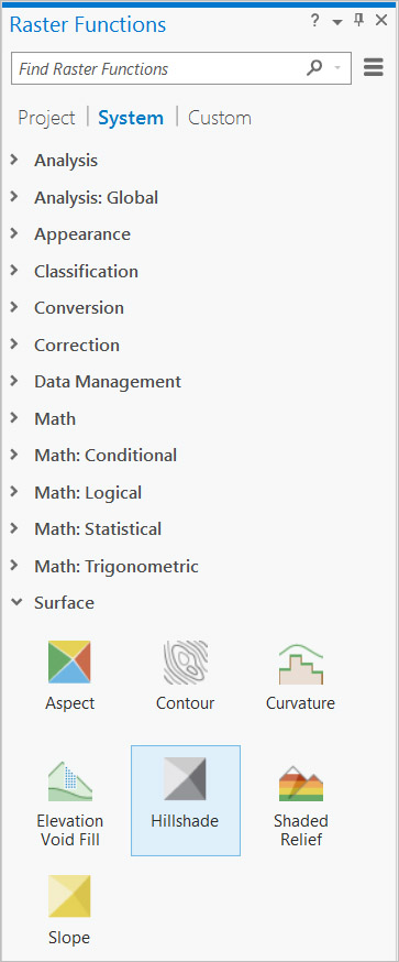
In ArcGIS Pro, raster functions are accessed from the Analysis tab. To use a raster function to apply a hillshade effect, follow these simple steps:
  1. Open the Raster Functions pane.
  2. Expand the Surface functions and select the Hillshade option (or search for Hillshade in the Raster Functions pane).
  3. Set Raster to your DEM dataset.
  4. Set Hillshade Type to Traditional or Multidirectional, as desired.
  5. Set Scaling to None if you are making a map at a single map scale (such as a printed map), or select Adjusted if you are making a multiscale map (such as a web map). You'll also want to select Adjusted scaling if you are making a hillshade of a large map extent, since no scaling would result in little terrain variation at small map scales.
  6. Set Z Factor to a higher number to exaggerate the height variation in the terrain, or use it to convert the elevation units to the x,y linear units if they happen to be different (see Applying a z-factor to learn more about this second reason).
  7. Click the Create new layer button at the bottom of the Raster Functions pane to create a new layer in the current map. Note that this is only a new display of the processed data—it is not a new raster dataset.
The figures below show how the traditional hillshade compares to the multidirectional hillshade for the Crater Lake dataset.

Figure 2. The traditional hillshade.

Figure 3. The multidirectional hillshade.
For Crater Lake, the beautiful texture of the multidirectional hillshade is even more pronounced when higher-resolution data is used. Figure 4 shows the results when 1-meter lidar data was used instead of the 30-meter data displayed in the previous examples.

Figure 4. The multidirectional hillshade with higher (1-meter) resolution data.
Not only does the multidirectional hillshade reveal more variation in the terrain, thus allowing you to find unique landform features, it also results in a 3D surface with a lighter overall tone. This is preferable when you plan to display other data, such as land use or a hypsometric tint (a DEM symbolized so that elevation values are displayed with varying colors, such as green for valleys, browns for midslope elevations, and white for mountaintops), transparently over the hillshade surface.

Figure 5. Elevation and bathymetry are colorized and displayed transparently over the multidirectional hillshade.
The hillshade effect is quick and easy to create in ArcGIS Pro, and it produces visually stunning results. Try it out yourself, and be sure to experiment with the multidirectional hillshade option.
To learn more about the hillshade and other raster functions, read these online help topics: Hillshade functionand Raster functions. To learn more about the multidirectional hillshade, read the blog post "Introducing Esri's Next Generation Hillshade."
Crater Lake data source: Robinson, J. E., 2012, "High-Resolution Digital Elevation Dataset for Crater Lake National Park and Vicinity, Oregon, Based on LiDAR Survey of August–September 2010 and Bathymetric Survey of July 2000": US Geological Survey Data Series 716. (Available at https://pubs.usgs.gov/ds/716/.)

lunes, 15 de enero de 2018

ArcWatch: GIS News, Views, and Insights

Create an Open Data Site in Three Steps

By Katelyn MacDonald
Technical Solutions Specialist, Esri Canada
It’s easy to create a publicly accessible site for sharing data in a variety of formats with ArcGIS. If your organization has an ArcGIS Online subscription, you already have access to the comprehensive open data capabilities the ArcGIS platform offers—they are free and come included as part of your subscription. Once open data is enabled for an ArcGIS Online Organization, the management of that open data occurs inside ArcGIS Hub.
ArcGIS Hub is a new and separate product that can be purchased to help governments improve how they engage and collaborate with their communities. Since open data capabilities are now managed inside ArcGIS Hub, open data users can preview some of these new ArcGIS Hub capabilities, but won’t have access to all of them unless they purchase an ArcGIS Hub license. Either way, whether you are an ArcGIS Online subscriber, or an ArcGIS Hub user, you can take advantage of the ArcGIS platform’s open data capabilities and launch an open data site in these three straightforward steps.
The blog post “9 tips to ensure high-quality open data downloads" provides the foundation for getting ready to launch an open data site. Once a plan has been developed and your data has been described and organized, the next step is to move it to the open data site. Not only do you need to make the data available to your users, you also want to provide a site that's easy to navigate and showcases your organization's unique brand. If you need ideas on how to develop your open data objectives, I suggest reading "4 ways to drive open data program success."
In this tip, you will learn the technical aspects of launching your open data site.
With the 2.0 version of ArcGIS Hub, organizations now have more control over the flow and feel of their open data sites, making them more accessible and interactive for data users. With the introduction of charts and widgets, ArcGIS Hub 2.0 facilitates increased collaboration between data providers and the community. The new version also enables file geodatabase downloads, a functionality that's been highly requested by users. For more information on what's new with ArcGIS Hub 2.0, read this ArcGIS Blog post.
You can set up your open data site in three steps:

Step 1: Configure the open data site.

To enable open data capabilities in your organization's ArcGIS Online site, navigate to Organization > Edit Settings, then click the Open Data tab along the left-hand side of the page.

Click the ENABLE OPEN DATA button. You can come back to this Open Data tab in the future to manage your sites or to disable open data if you so choose.

Once you have open data groups created, you will see them listed in the open data pane. You can also use this pane to assign group members to open data groups, or go to the View My Content page to share data to your open data groups.
The MANAGE SITES button will take you to the ArcGIS Hub administrative application. Also on this page are the ASSIGN GROUP MEMBERS and VIEW MY CONTENT buttons. Staff in the Administrator role of your organization can click the ASSIGN GROUP MEMBERS button to batch assign a batch of ArcGIS Online members to your open data group. Clicking the VIEW MY CONTENT button takes you to the Content tab of ArcGIS Online.

Work with the Open Data Site Manager
Click the MANAGE SITES button to open the Site Manager page. This is where an open data administrator, can create an open data site or visit, manage, and edit an existing site by clicking its name. Each open data site is listed on this page, along with the associated management functionalities.
To create your first open data site, click the green Create New Site button.
The Site Configuration page is used to create the open data site.

You can open the page by clicking Create a new site. This page is where you will configure your Hub (open data) site, including the following:
  • Site Name—Provide a name for the site. The name displayed will inform users which open data site they are visiting.
  • Site URL—Choose the URL that will be used to navigate to your open data site.
  • Browser Icon—You can upload a custom icon that displays on the left of the site URL in the browser.
  • Custom Domain—Configure a custom domain name server (DNS). Check with your domain name registrar for details on configuring your DNS.
  • Google Analytics—If you want to use Google Analytics to track the usage of your open data site, you can input the tracking ID.
  • Sharing settings—You can choose to share your site with the ArcGIS Hub team only, your entire organization, or the public.
  • Enforce HTTPS—open data sites are accessible over HTTPS, however, sites with custom domains are not accessible over HTTPS. You can test whether the site works over HTTPS by clicking Test Your Site First.
  • Set Extent map—Either choose Draw Extent or Map Navigation to select the map extents of the data you will be uploading to the open data site.
  • Basemaps—Use default basemaps or custom basemaps from your organization's basemap gallery.

Clicking Next will bring you to the Groups Manager. This is where you add data to your open data site. By clicking the green Add button (next to your group name under Available Open Data Groups, you will be adding all the data associated with this group to the site. If you intend to federate your open data site across multiple organizations, you can disable the selection of the option Only groups in your Organization to view all groups publicly available to add to your site.

Step 2: Prepare and manage data in an open data-configured ArcGIS Online group.

ArcGIS Online Roles
There are specific ArcGIS Online privileges that need to be granted to your users to enable and manage the open data site. These privileges are automatically granted to the Administrator role. For other roles, you will need to configure specific privileges based on the user's responsibilities. These privileges can be granted and revokedin ArcGIS Online by an Administrator. If the user responsible for the open data site is not the administrator, specific privileges will need to be assigned to the user's ArcGIS Online role. Privileges include the following:
  • Manage open data sites—This privilege enables the creation and management of the site. This is required if the administrator of the open data site does not have an Administrator role in ArcGIS Online.
  • Make groups available to open data—This privilege is given to ArcGIS Online group managers. Group managers will also require the following privileges: Create, update, and delete; Share with groups; and Make groups visible to public.
The Share with groups privilege will be the only one required for colleagues who create data that will be consumed in the open data group but don't need to create the group or manage the open data site.
Then, these users must be added to your ArcGIS Hub. You do this within the ArcGIS Hub administrative application.
For detailed information, see Using custom roles with ArcGIS Hub.
Once you've ensured that your data is prepared, your next step is to share this data with an ArcGIS Online group to be used in the site. You can create a group or modify an existing one; just keep in mind that the purpose of the group is to share the data you plan to showcase on your site. Any data you add to the group will be added to your open data portal.
On the Groups tab of ArcGIS Online, click Create Group.
Populate the group descriptions with information that describes the group's purpose. It's a good practice to include "Open Data" in the name to make it easier to find this group when creating your open data site.
Meaningful tags will also assist group users and are mandatory inputs for group creation. Tags can be separated using commas. Ensure that the status is set to Public and you have checked the check box for Allow this group to be accessed in Open Data sites.

Make your group public and designate it as available for use in open data sites.
You can add the following types of data to the group to be used by the open data site (each will have its own dataset page on the site):
  • Hosted feature services
  • ArcGIS Server feature services
  • ArcGIS Server map services
  • Image services
  • CSV files
  • Web maps
  • Word documents
  • PDFs
You can add external URLs as well—these URLs would not have their own dataset page but would be searchable and could be accessed from the search results. This is handy when you have data or information on other sites that you'd like to be accessed from your open data site.
Data can be added to the group through the Content page of ArcGIS Online. After checking the white check box to the left of your data name, click Share > Access and choose to share the item with your open data group. Your open data groups will have "(Open Data)" at the end of their names to easily indicate which groups are being used in the site. You can add a batch of data to the group by checking multiple datasets in your Content before clicking Share.

Step 3: Design the look of your open data site and make it public

After clicking Next, you will be brought to the Site Editor, where you can configure the look and style of your open data site. Using the editor tools provided or your own HTML/Cascading Style Sheet (CSS) code, you can design the site's headers and footers. Use the theme and layout builder to customize the body of your site.

Use the Site Editor to configure your open data home page.
When you visit the Site Editor for the open data site for the first time, there's already a preconfigured layout and template for you to begin working with—just point to each element and click the associated gear icon. Conversely, you can click the Close (x) button on each element to remove the entire template as it stands, and start again from scratch. Any element can be resized by clicking and dragging. At any point in time when designing your site, you can click the Admin button in the Site Editor to go back to the configuration page for your open data site.
When designing your page, it's good to keep in mind how the public is going to interact with the site and discover new data. The Layout Builder has cards that you can drag onto the page to design your site however you like. Included in these elements are the following:
  • Dataset—Use this card to highlight specific datasets or applications that you would like featured on the home page of your open data site. For example, a county may find that users are most interested in parcel data for its locality and thus may want to feature this dataset in any easily accessible spot on the first page.
  • Category—The Category card can be used to group datasets by a search query. When a user clicks one of the categories, all datasets within the defined category are returned in the search results.
  • Chart—This can be used to create simple charts. Alternatively, you can use a defined JSON specification to create a custom chart, and both will be updated automatically as the dataset is updated. A simple chart can be created from a dataset in the open data group: choose Build a chart and then Find a dataset. You will then be prompted to choose the field you would like to chart. Use JSON to build different types of charts and change the chart colors.
  • iFrame—This card allows you to insert just about anything into your open data home page. Insert a URL to embed a web resource to the page, such as web maps or applications. You could also include a geoprocessing widget with a geoprocessing service used to complete a task for your users.
  • Summary Statistics—This provides statistical information for a dataset that is dependent on the field type chosen to be highlighted. It can provide snapshots of information at a glance that is updated as a dataset is updated.
  • Gallery—This card can be used to point to content by a group within your organization that you'd like to add to your home page, including web maps and applications.
For more information on the Layout Builder, view the Design the layout of your Hub (open data) sitedocumentation.
After your site has been saved, you can navigate back to the Site Administrator page by clicking the Admin button in the Site Editor. You will see several other configuration options:
Sites
  • Capabilities—Manage the capabilities associated with your open data site. At this time, there is the option to display PDFs and document links inside iFrames. There are other beta options available as well.
  • Pages—Each open data site can have any number of pages. These pages can be used to showcase datasets or promote initiatives within the open data site, or however your organization would like.
Data
  • The Data tab opens the Data Manager, a management tool that administrators can use to identify issues with datasets in the open data site. This is where you can also disable automatic download caching when users download datasets (use the toggle if it's available) and manually refresh datasets to ensure that they are the most up-to-date version (arrow button). One recommendation is to disable automatic download caching for datasets that are large or don't change very often.
Team
  • All open data users can view the Team manager to see who can collaborate in sites and pages. Administrators can also add and remove members from the open data team.
Once you've designed the look and functionality of your open data site, click the Preview Site tab to look at your handiwork! Do you see all the data you would like to make available to your users? Is the site easy to navigate and visually appealing? You'll want to keep in mind the audience for your open data when fine-tuning the site.
If you navigate away from the Site Builder page at any time, you can reopen it by clicking Organization > Edit Settings > Open Data tab > Manage Sites. Under each of your open data site names, there are buttons to direct you to the configuration pages for the site. This is also where you make your site public by toggling to choose Share with the public. Once you've finished designing the site, be sure to make it public so that users can visit it.
That's it! You've successfully launched your open data site. Don't forget to promote your site so that the public can easily discover, download, and use your authoritative open data to solve problems.
You can take your open data even further by using the Community and Initiatives premium capabilities of ArcGIS Hub. Learn more about how to license ArcGIS Hub and get access to these additional community engagement and initiative creation features at esri.com/hub.