The Science of Where Comes to Life at the Esri User Conference
By Citabria Stevens, ArcNews Editor
and Carla Wheeler, ArcWatch Editor

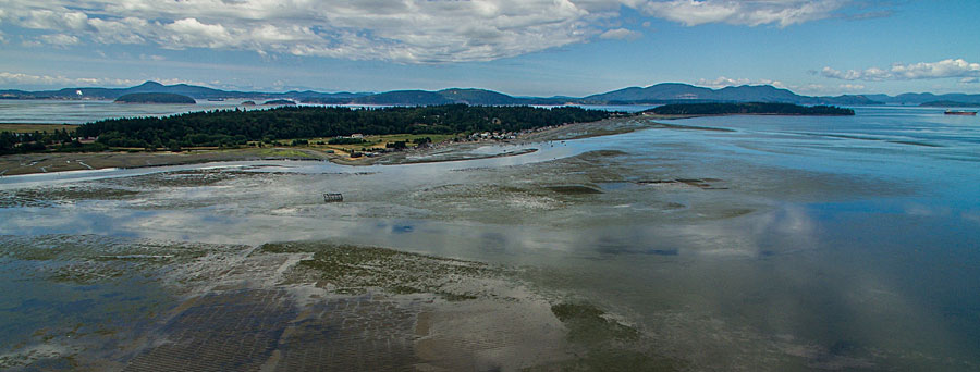
Taylor Shellfish Farms uses GIS to manage aquaculture operations in Samish Bay, Washington, and other locations. Photo courtesy of Taylor Shellfish Farms.
Taylor Shellfish Farms of Shelton, Washington, takes
The Science of Where to the tidal flats of Puget Sound to sustainably produce such delicacies as Manila clams, Pacific and Shigoku oysters, mussels, and geoduck.
In Canada,
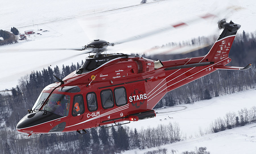
Shock Trauma Air Rescue Service (STARS) uses The Science of Where to manage thousands of annual missions to transport, via helicopter, critically ill and injured patients from mostly rural areas to hospitals best suited to treat them.
The
Chesapeake Conservancy in Annapolis, Maryland, puts The Science of Where to work to prioritize and plan restoration and conservation efforts in the Chesapeake Bay.
And The Science of Where gives
Oakland County, Michigan, the ability to share information with government staff and the public about topics as diverse as economic development, delinquent taxes, and opioid addiction.

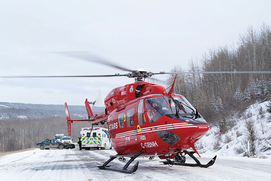
STARS transports patients by helicopter to medical facilities. Photo courtesy of STARS/Mark Mennie.
To accomplish all this, The Science of Where must be versatile, agile, powerful, and whip smart, which leads to the obvious questions; What is this science that these four organizations depend on to do critical work, and where does it derive its capabilities from?
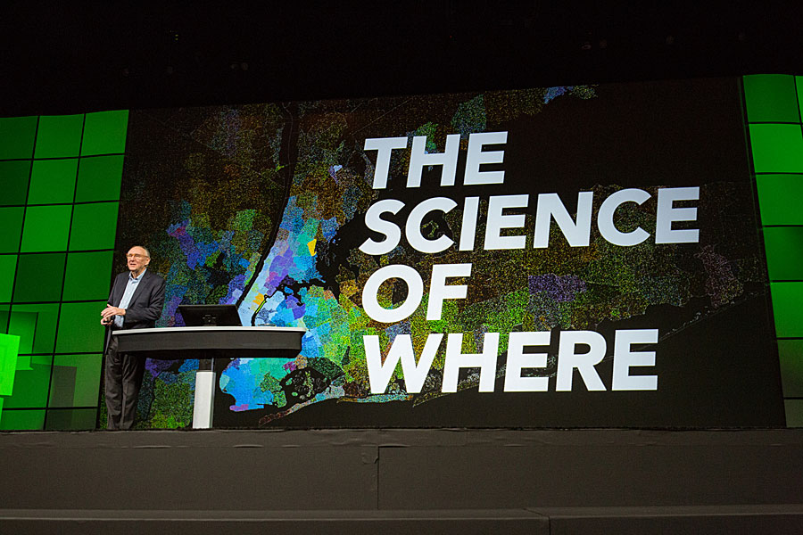
"Simply stated, it's the science of geography and the technology of GIS," said Esri president Jack Dangermond, during his opening keynote at the 2017
Esri User Conference (Esri UC). "The Science of Where is a framework for applying science to almost everything. That is a very powerful notion for me."
The Science of Where was the theme of the conference, which drew nearly 18,000 people from around the world to San Diego, California, last July. But behind the phrase is a system of understanding driven by science, technology, and people.
Dangermond called GIS a metascience underpinned by geography, data science, modeling, analytics, visualization, and computer science. "At its heart, [GIS] is a system of insight where we can do spatial analytics, look at relationships, and approach problem solving in a holistic way because this platform integrates people and processes and all the data about them," he said. "You, ladies and gentlemen, are working with all the dimensions of information and using the power of where to integrate it."

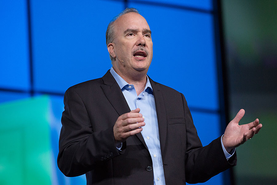
Esri president Jack Dangermond called GIS a “metascience.”
The Science of Where also brings people into the equation. Posters that hung in the hallways of the San Diego Convention Center said, "I Am The Science of Where," and several conference-goers echoed that idea by Tweeting "Yes I am #TheScienceOfWhere" on Twitter.
Dangermond underscored the importance of people working together to confront problems such as pollution, loss of nature, climate change, food shortages, social conflict, and natural disasters. "We are going to have to do everything we possibly can to better understand and…collaborate to address [these issues]," Dangermond said, adding that GIS is only part of the equation. "Our technology is really nice, but from my perspective, it's about five percent of the deal. It's really collaboration, organization, and good thinking—the kinds of things all of you do—that make your system successful."
The challenges may be great, but Dangermond says he's an optimist. "It's a high aspiration," he said. "Can we make a difference with our work and turn this around? My view is, yes,we can!"
Practicing The Science of Where in Aquaculture

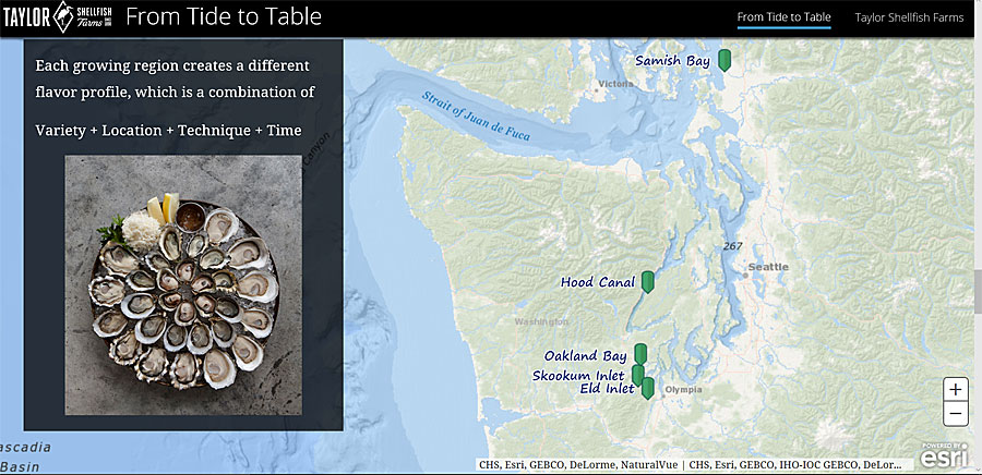
Taylor Shellfish Farms created a story map to illustrate where the oysters, clams, mussels, and geoduck are grown.
Where does The Science of Where make a difference? In industries such as aquaculture, where Taylor Shellfish Farms is using GIS to make farming practices more sustainable.
While many organizations at the Esri UC have used GIS for decades, Taylor Shellfish Farms has only been using Esri technology for about one year. However, location information has always been important to this fifth-generation, family-owned business, which grows shellfish on 12,000 acres of leased or owned tideland in Washington state.
The Taylor family and employees, represented at the Esri UC Plenary Session by Nyle Taylor and Erin Ewald, use GIS to map their 30 farming sites, analyze farming conditions, identify the best growing areas for different shellfish species, and conduct surveys to meet environmental requirements.

Nyle Taylor holds up a geoduck.
"When I started at Taylor [Shellfish Farms], we were using hand-drawn maps, and I knew there had to be a better way," said Erin Ewald, assistant director of regulatory and environmental compliance for the business. "So Nyle and I are modernizing our company through GIS."
The company, which also owns and operates three oyster bars in Seattle, started shellfish farming in 1890. The business was founded by Nyle's great-great grandfather, J. Y. Waldrip, who first dabbled in gold mining and agriculture before diving into aquaculture in the Puget Sound. "He found our native Olympia oyster and started farming those," said Taylor, farm project coordinator for Taylor Shellfish Farms. Today, the company has expanded from its first site in Totten Inlet to locations such as Skookum Inlet, Hood Canal, and Oakland Bay.

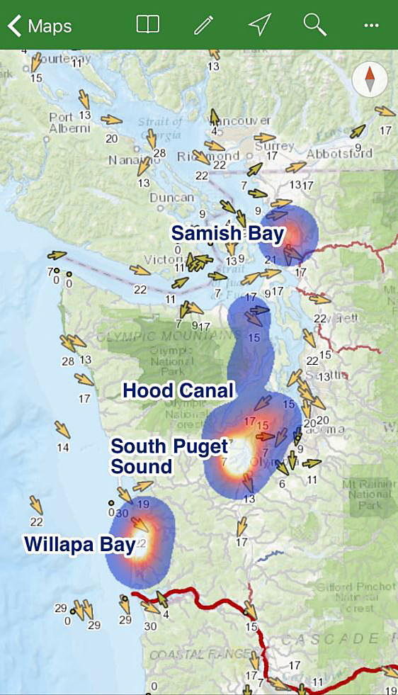
This heat map shows the concentration of farms operated by Taylor Shelllfish Farms.

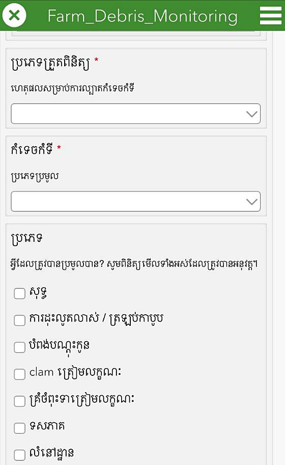
Ewald used Survey 123 for ArcGIS to create this survey in the Khmer language.
"In Samish Bay, the tide can recede over a mile to expose large, sandy tidal flats rich with nutrients. We grow oysters, clams, and geoduck here," Taylor told the Esri UC audience. "While all you geogeeks at this geoconference may have thought [that] this is [pronounced] 'geoduck,' it's pronounced 'gooey duck,'" he said, eliciting laugher from the crowd.
Taylor then lifted a live geoduck from a box. "The geoduck is a Pacific Northwest native and the world's largest burrowing clam. In the wild, they can live more than 100 years and weigh more than 12 pounds," Taylor said. "This may be the only time a geoduck is a copresenter on the User Conference stage."
How does GIS help Taylor Shellfish Farms grow geoducks and other ocean edibles sustainably and more efficiently? Ewald and Taylor said it's by using mobile apps like Explorer for ArcGIS, which lets staff bring real-time business, operations, and environmental data onto the farms even when there is no cell phone coverage. Rather than deal with paper maps, which can get sopping wet, the farm managers can view a map of the farming area on their smartphones. They can even add information to the map using a sketching tool, for example, to suggest areas where the farm might expand.

STARS uses GIS to help plan missions, which often take helicopters to rural areas to pick up patients. Photo courtesy of STARS/Mark Mennie.
"This ability to take a wealth of GIS data into the field—like our farms and priority habitats and substrate types—helps us understand the environment we are working in," Ewald said. "As we combine this new understanding with generations of experience in a suitability analysis, we use this data to identify optimal growing areas for our different shellfish species."
Using Survey123, Ewald can quickly configure digital surveys that workers can use to collect environmental and other data for regulatory agencies. For example, she created a short, easy-to-use herring spawn survey that crews can use to simply check off whether herring spawn are present where farm activities, such as dredging, harrowing, tilling, or bed preparation, are taking place. "Herring are a critical food source for Washington state's endangered salmon, and we survey the beach so we ensure [that] our actions don't disturb their spawning sites," she said. Because Taylor Shellfish Farms employs multilingual crews, Ewald creates surveys in Khmer and Spanish in addition to English.
Taylor Shellfish Farms recently began mapping farm beds using imagery captured by a drone and processed using Drone2Map. Bed layouts for where to plant the shellfish can be designed in the office using the processed imagery. "Laying out farm beds prior to using Drone2Map was a boots-on-the ground approach, where our farmers paced lines through the mud," Taylor said. "Drone imagery revolutionizes how we do it. Using a digital terrain model, it's easy to see the natural drainages in the beach. We can build our beds around these to avoid our seed being washed away."
Saving Lives with The Science of Where

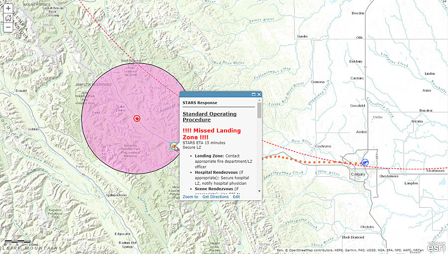
ELC uses ArcGIS GeoEvent Server to provide dynamic SOPs on a map.
STARS, a Canadian nonprofit organization that dispatches helicopters to transport seriously ill and injured people, uses The Science of Where to better manage its response to emergencies.
STARS mainly operates in remote areas of Alberta, British Columbia, Saskatchewan, and Manitoba. STARS helicopters are dispatched to medical emergencies, such as heart attacks and strokes, or to traffic, recreational, and industrial accidents.
While the rescues are often in the news, much of the critical work at STARS goes on behind the scenes at the organization's Emergency Link Center (ELC), a 24-hour medical communications and dispatch center. That's where Kevin Hatch and Paul Wiles work, bringing the organization technology that speeds up response times, better manages a coordinated and appropriate response to each situation, and tracks the helicopters during missions.
For example, GIS technology is being used to automate the standard operating procedures (SOPs) that STARS follows to determine whether a helicopter, rather than a ground ambulance, needs to be sent to an incident. "We use a dynamic set of SOPs to tell our dispatchers precisely what they need to know so they can make that decision," Hatch, a telecommunication specialist for STARS, said during the Esri UC Plenary Session presentation.

Cassandra Pallai from the Chesapeake Conservancy showed the audience how its ultra-high-resolution land cover dataset for the Chesapeake Bay watershed can help determine where restoration projects might be most beneficial for cleaning up the bay.
ELC uses
ArcGIS GeoEvent Server to provide dynamic SOPs as each incident unfolds, from what procedures to follow before deciding to send a helicopter to what to do as the mission unfolds once the craft is dispatched. A model created with ArcGIS GeoEvent Manager generates the dynamic SOPs. "It tells us what we need to know and when we need to know it," said Wiles, a GIS and telephony technologist for STARS. "This improves efficiency, reduces human error, and helps us ensure [that] the best lifesaving decisions are made."
Using the case of a one-car rollover in Banff National Park in Alberta as an example, Hatch illustrated how dynamic SOPs can also help once a mission is under way. A decision was made to send a helicopter to the scene where two people were trapped in a vehicle and a third person was ejected.
"Now that we've assigned a resource, GeoEvent [Server] has created a new feature [that] uses the automatic vehicle location (AVL) of the helicopter," Hatch said. "Using factors such as the status of the aircraft and the base it was dispatched [from], the SOPs are instructing the dispatcher to perform actions such as giving updates to our pilots and air medical crews."
ArcGIS GeoEvent Server will even alert a dispatcher if an action has been missed. "Our dynamic SOPs are responsive," Hatch said. "In this case, the dispatcher neglected to confirm whether a landing zone had been secured."
A missed landing zone alert popped up in red on a map. "Because our SOPs can adapt," said Hatch, "GeoEvent [Server] alerts us, and the dispatcher is instructed to secure the missing landing zone."
The ELC is also using GIS to spatially analyze historical flight data to study where STARS flies (and where it doesn't) and how those patterns change over time.
Hatch and Wiles showed photographs of some of the patients who had been transported by STARS. "When we talk about dynamic SOPs, mapping, spatial analysis, innovation, and engagement, what we are really talking about is improving the tools our team uses to help us make more success stories," Hatch said. "Because at the end of the day, it's about the patient."
The Science of Where Pollution Gets Cleaned Up

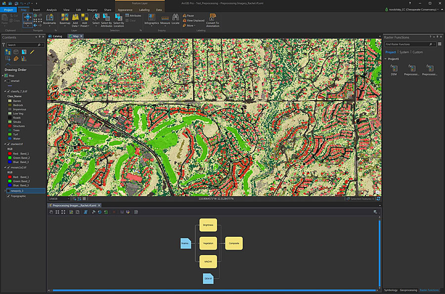
Chesapeake Conservancy uses raster functions in ArcGIS Pro to preprocess and classify raw imagery, turning it into land cover that helps with management tasks like green infrastructure planning.
Beset by pollution, population growth pressures, and changes in land use, the Chesapeake Bay's health suffered for many years. But over the last four decades, efforts by governmental agencies and the nonprofit Chesapeake Conservancy have brought the bay back from the brink of destruction.
"But we still have a long way to go," said Jeff Allenby, director of conservation technology for the Chesapeake Conservancy.
The Chesapeake Bay is the largest estuary in the United States and the third largest in the world, stretching 200 miles along the mid-Atlantic coast. The watershed that feeds into it is home to more than 18 million people and occupies more than 64,000 square miles in six states.
The conservancy works with cities, counties, and states to restore the Chesapeake Bay to health. It provides geospatial analysis tools and high-resolution aerial imagery and elevation data to its partners to better target conservation efforts.
In an 18-month period, conservancy staff worked with the
Chesapeake Bay Program and partners, such as the University of Vermont Spatial Analysis Laboratory and WorldView Solutions Inc., to create an ultra-high-resolution land-cover dataset for the watershed. It was released in December 2016.

Phil Bertolini challenged his team to expand the use of GIS beyond the knowledgeable few and build up a new generation of users among municipalities, businesses, and the public.
"This data is fundamentally changing the way that managers think about conservation and restoration," Allenby said. "It's providing us with actionable information and refining the way that we can evaluate the benefits of individual projects."
Constantly updating the data, however, would be costly and time-consuming. So, using ArcGIS Pro, the Chesapeake Conservancy used imagery from the
National Agriculture Imagery Program (NAIP) to create a new false-color image of the region and segment it, streamlining the entire land classification workflow into one processing model.
"ArcGIS Pro is reducing the amount of time that it takes us to go from raw imagery to land cover," Allenby told the audience.
"Having this capacity at our fingertips is incredibly exciting," said Cassandra Pallai, the conservancy's geospatial program manager.
To classify more than two terabytes of the most recent NAIP imagery, it would take the conservancy just over 150 hours instead of more than 2,500 hours. Additionally, the conservancy can classify land cover in just one local study area or, using
ArcGIS Image Server in the Microsoft Azure cloud, create land-cover classifications for an entire landscape. This enables the conservancy and its partners to better understand how development in one area might affect local streams and rivers and, thus, the entire bay.
All necessary pollution control measures in Chesapeake Bay must be in place by 2025. So it's imperative that counties evaluate the impact that their developments can have on water quality and determine where local water quality monitoring or restoration might be most beneficial.
"Once we know our priorities, we can create customized action maps for our local partners," Pallai said. "Together, Image Server and the processing capacity of the cloud are enabling us to spend less time making the data that we need to meet our goals and more time on conservation."
Extending The Science of Where

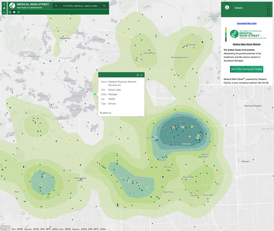
Oakland County’s Medical Main Street map, which highlights the county’s thriving and growing health care businesses, markets the area as a destination for medical services.
Oakland County, Michigan, is keeping pace with changes in its own municipalities by expanding GIS use beyond the knowledgeable few. The idea behind this is that the county can build a map or app once, pay for it once, and allow everyone to benefit.
"The recent recession . . . deepened our commitment to shared services," said Phil Bertolini, Oakland County's deputy county executive and chief information officer. "Through Web GIS, we've grown our distributed GIS model by combining the value of our many collaborative systems of record [into] a powerful system of systems, which allows us . . . to branch out to all our municipalities, businesses, and citizens."
Bertolini showed the audience the county's
Access Oakland Open Data Portal, which uses maps to promote certain economic programs and attract new businesses to the area. The Medical Main Street map, for example, underscores Oakland County's thriving—and growing—health care industry, and Global Oakland markets southeastern Michigan as an advantageous destination for businesses from around the world to open new locations.
"To date, we have more than 400 new businesses located in Oakland County with an economic investment of $3.9 billion," said Bertolini.
The success of these open data initiatives spurred Bertolini to see if Oakland County could go even further. He challenged his team to build up a new generation of GIS users countywide.
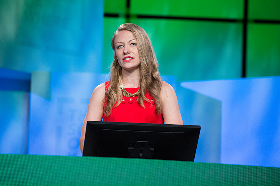
"What was our approach?" asked Tammi Shepherd, Oakland County's chief of application services. "Grow our tree by finding and inspiring just one user, who would then add hundreds more."
Social media managers incorporated easy-to-make and colorful maps into their Facebook, Twitter, and blog posts. A suite of apps was created to simplify how the tax administration department stakes notices on the properties of citizens who have not paid their taxes.
An internal app was created for the equalization division that displays all the details about county properties, including parcel acreage, wetlands, and historical imagery. This app was then added to a suite of standard product offerings, making it available to any municipality in the county to use and customize.
"We are engaged in the most important work of our careers," Bertolini said. "Two years after challenging my team, we have hundreds more users in a distributed GIS model across our county departments and municipalities."